
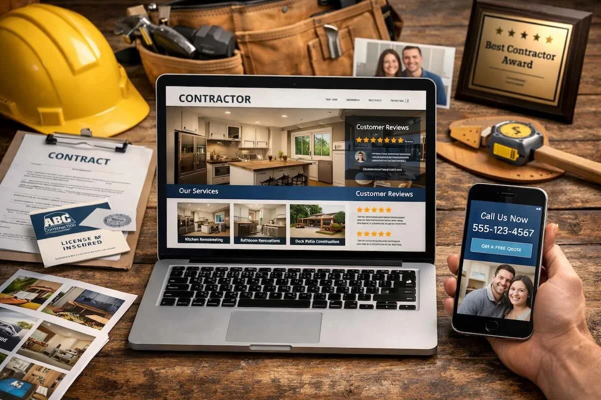
What Makes a Contractor Website “Professional” to Customers?
Customers decide fast. Before they call, many will scan your site on a phone, compare you to two or three competitors, and make a gut call about trust. A professional contractor website is not about flashy design. It is about clarity, credibility, and an easy path to contact.
Below are the exact signals customers tend to read as “professional,” plus practical ways to tighten them up without overhauling everything.
It answers the first three questions in five seconds
Most visitors arrive with three questions:
What do you do?
Where do you do it?
How do I reach you right now?
If your home page makes them hunt, they bounce. A simple headline, a short service line, and a visible call button go a long way. On mobile, that call button should be obvious without scrolling.
It feels local and specific, not generic
Customers trust specificity. “Quality work” is vague. “Kitchen remodels in older homes” is concrete. So is “licensed and insured in this state,” if that is true for your business.
Professionalism shows up in the details: the towns you serve, the types of projects you take, and the way you explain your process. Even a short “What to expect” section can reduce uncertainty.
It proves the work with the right photos
Customers do not just want pretty pictures. They want proof you have done projects like theirs.
Use fewer photos, but make them stronger. Include a mix of wide shots and close ups. Show finishes, transitions, and craftsmanship. If you share before and after, keep the angles consistent so the change is clear.
A gallery also feels more professional when it is organized by project type, not one endless scroll.
It builds trust with real world credibility signals
Customers look for signs you are established, reachable, and accountable. You do not need to oversell. You do need to remove doubt.
Here are credibility elements that commonly make a difference:
A clear business name and consistent branding across pages
Reviews or testimonials that include project type and location context
A dedicated page for licenses, insurance, and warranties, if applicable
Team and company details that explain who shows up on site
A physical service area and clear hours or response expectations
Add these elements naturally. Place them where customers are already looking, like the footer, the contact page, and the service pages.
It makes contacting you feel easy and safe
A professional contractor website guides the customer to the next step. It should also set expectations so you get better leads.
What a strong contact experience includes
A good contact setup usually has three parts: a tap to call option, a short form, and a clear promise about what happens next. For example, “We respond within one business day,” if you can reliably do that.
Keep forms short. Ask only what you need to respond intelligently. If you want project details, offer simple choices like project type and timing, then one open text box.
It reads clearly on a phone
Most contractor site traffic is mobile. Customers notice when a site feels cramped, slow, or hard to tap.
Mobile professionalism comes from basics: readable text, buttons that do not misclick, and pages that load quickly on cellular service. If your photos are huge and uncompressed, the site will feel sluggish. That hurts trust, even if your work is excellent.
It has service pages that match how customers search
Customers search by problem, not by your internal categories. They look for phrases like “basement finishing,” “deck repair,” or “bathroom remodel contractor.”
Each core service deserves its own page with:
A plain language overview of the service
Who it is a good fit for
Common options or materials, when relevant
A simple process outline
Photos of that specific service
This structure also helps you avoid a bloated home page. It keeps the site focused and easier to navigate.
It sounds confident, but not salesy
Professional copy is calm and clear. It avoids hype. It avoids vague promises. It explains what you do, how you do it, and what the customer can expect.
If you use guarantees, keep them precise. If you claim awards, list them accurately. If something is optional, say so. Customers can feel the difference between confidence and exaggeration.
FAQ
How many pages does a contractor website need to look professional?
Most small contractors can start strong with five to seven pages: Home, About, Services, Project Gallery, Reviews, and Contact. Add service pages as you grow.
Do customers care about a contractor website design, or just reviews?
They care about both. Reviews build confidence, but design affects usability. If the site is hard to use, many never reach your reviews.
What is the fastest way to improve trust on my site?
Tighten your home page message, add project specific photos, and make contact one tap away on mobile. Those changes usually show results quickly.
Bringing it all together
A professional contractor website is a trust tool. It reduces uncertainty and makes the next step obvious. When customers can quickly understand your services, see proof, and contact you easily, you feel reliable before you ever pick up the phone.